- Published on
A Design Concept for a Travel Website
My notes on building a new interface for a travel website.
A recent job posting led me to travelsalem.com. The website design is arguably dated and navigation proved to be cumbersome using the complex menu system. Then I ran into bugs.
It didn't take long to realize the site needed a modern design. As a personal challenge, I built a one-page demo to address the issues I experienced and perhaps sparks ideas about how best to improve the website's utility. This article explains my design decisions.
- View the demo.
- View the source code.
Update 9/31/2021
Travel Salem has recently updated their website since I wrote this article. It is much improved. Unfortunately, I didn't screen shot the old design to provide better context for this article.
Goals
To begin, I ran the website through Google Lighthouse to get a baseline of how the site measured up. The scores were pretty low and in particular, the performance was around 8%. Is Google Lighthouse the definitive test? Perhaps not, but travelsalem.com is a content heavy website, not a realtime, dynamic web app. I believe it should perform much better.
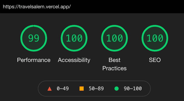
From the project outset, my goal was to achieve perfect Google Lighthouse scores with a simple, modern user interface. I chose to build the demo using Next.js, primarily for static site generation and image optimization. And I used Tailwind CSS to style the website.
Menus
The current site's navigation consists of two drop-down menus and a traditional flat menubar. One of the drop-down menus is often repeated in expanded form at the top of visited pages - giving the user up to four navigation options. The other drop-down menu is three levels deep and at times renders off page with no way to access the hidden menu items.
From a usability perspective, navigating multi-level drop-downs risks irritating users when their cursor slips off the menu system, sending them back to square one. I feel the whole point of content based websites is to present the content, not hide it away in a menu. My design eliminates all drop-down menus.
Content
To increase the site's utility is to provide easy access to pertinent content with the fewest clicks. My design moves all the high level menu categories onto the page and presents this information in a more visually appealing and engaging manner.
For local businesses looking for exposure via travelsalem.com, my design displays all business information directly on the main page, categorized by industry. There's no need to search or drill down a menu system to locate a plumber or florist.
Sitemap
I added a proper footer that provides a simple and clear directory to site content and Travel Salem's company information. The directory proved simple enough to include it as the only menu choice for mobile devices - and it vertically scrolls.
Final Thought
This project was fun and offered challenges I'd not experienced before - such as horizontal scrolling, tabbed based UI components and image optimization techniques beyond what Next.js offered.
One of the biggests time-sinks was dealing with image optimization. Google Lighthouse often reported incorrect image sizing errors, or inaccessible overlay text, or a too high image request count. Now, I think I found the right balance of images, SVGs and plain text.
And what of the Google Lighthouse scores? All green. Not too bad. 😎
